
Further enhancing the in situ visualization of performance data in parallel CFD applications
- Published
- Accepted
- Received
- Academic Editor
- Muhammad Aleem
- Subject Areas
- Distributed and Parallel Computing, Scientific Computing and Simulation
- Keywords
- Parallel computing, Performance analysis, In situ processing
- Copyright
- © 2021 Alves and Knüpfer
- Licence
- This is an open access article distributed under the terms of the Creative Commons Attribution License, which permits unrestricted use, distribution, reproduction and adaptation in any medium and for any purpose provided that it is properly attributed. For attribution, the original author(s), title, publication source (PeerJ Computer Science) and either DOI or URL of the article must be cited.
- Cite this article
- 2021. Further enhancing the in situ visualization of performance data in parallel CFD applications. PeerJ Computer Science 7:e753 https://doi.org/10.7717/peerj-cs.753
Abstract
This paper continues the work initiated by the authors on the feasibility of using ParaView as visualization software for the analysis of parallel Computational Fluid Dynamics (CFD) codes’ performance. Current performance tools have limited capacity of displaying their data on top of three-dimensional, framed (i.e., time-stepped) representations of the cluster’s topology. In our first paper, a plugin for the open-source performance tool Score-P was introduced, which intercepts an arbitrary number of manually selected code regions (mostly functions) and send their respective measurements–amount of executions and cumulative time spent–to ParaView (through its in situ library, Catalyst), as if they were any other flow-related variable. Our second paper added to such plugin the capacity to (also) map communication data (messages exchanged between MPI ranks) to the simulation’s geometry. So far the tool was limited to codes which already have the in situ adapter; but in this paper, we will take the performance data and display it–also in codes without in situ–on a three-dimensional representation of the hardware resources being used by the simulation. Testing is done with the Multi-Grid and Block Tri-diagonal NPBs, as well as Rolls-Royce’s CFD code, Hydra. The benefits and overhead of the plugin's new functionalities are discussed.
Introduction
Computers have become crucial in solving engineering problems. However, standard computers do not have enough power to run more complex simulations (such as those involved in modern engineering problems, like designing an aircraft) on their own. They require parallelized simulation (for instance of the air flowing through the airplane’s engine) to be run in High Performance Computing (HPC) hardware. Such infrastructures are expensive, as well as time and energy consuming. It is thus imperative that the application has its parallel performance tuned for maximum productivity.
There are several tools for analyzing the performance of parallel applications. An example is Score-P1 (Knüpfer et al., 2012), which is developed in partnership with the Centre for Information Services and HPC (ZIH) of the Technische Universität Dresden. It allows the user to instrument the simulation’s code and monitor its execution, and can easily be turned on or off at compile time. When applied to a source code, the simulation will not only produce its native outputs at the end, but also the performance data. Figure 1 illustrates the idea.
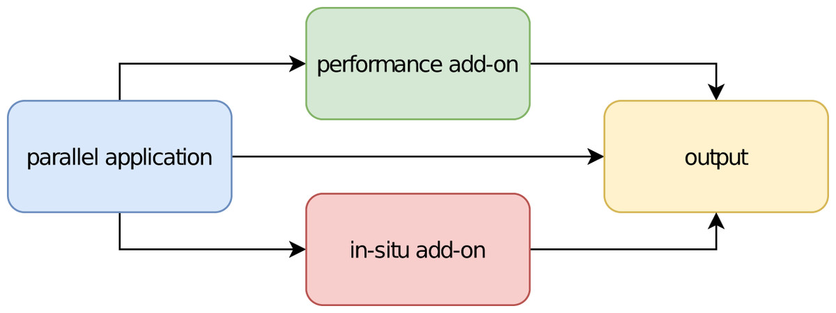
Figure 1: Schematic of software components for parallel applications.
However, the tools currently available to visualize the performance data (generated by software like Score-P) lag in important features, like three-dimensionality, time-step association (i.e., frame playing), color encoding, manipulability of the generated views etc.
As a different category of add-ons, tools for enabling in situ visualization of applications’ output data–like temperature or pressure in a Computational Fluid Dynamics (CFD) simulation–already exist too; one example is Catalyst (https://www.paraview.org/in-situ/) (Ayachit et al., 2015). They also work as an optional layer to the original code and can be activated upon request, by means of preprocessor directives at compilation stage. The simulation will then produce its native outputs, if any, plus the coprocessor’s (a piece of code responsible for permitting the original application to interact with the in situ methods) ones, in separate files. This is illustrated in the bottom part of Fig. 1. These tools have been developed by visualization specialists for a long time and feature sophisticated visual resources (Bauer et al., 2016).
In this sense, why not apply such in situ tools (which enable data extraction from the simulation by separate side channels, in the same way as performance instrumenters) to the performance analysis of parallel applications, thus filling the blank left by the lack of visual resources of the performance tools?
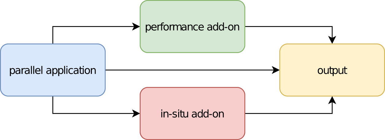
This work is the third in a series of our investigations on the feasibility of merging the aforementioned approaches. First, by unifying the coinciding characteristics of both types of tools, insofar as they augment a parallel application with additional features (which are not required for the application to work). Second, by using the advanced functionalities of specialized visualization software for the goal of performance analysis. Figure 2 illustrates the idea.
Figure 2: Schematic of the software components for a combined add-on.
In our first paper (Alves & Knüpfer, 2019), we mapped performance measurements of code regions–amount of executions and cumulative time spent–to the simulation’s geometry, just like it is done for flow-related properties. In our second paper (Alves & Knüpfer, 2020), we added to such mapping communication data (messages exchanged between MPI ranks). Henceforth, this feature shall be called geometry mode.
Following feedback we have received since, we thought about how our approach could be used to assist with the performance optimization of codes without an in situ adapter. What happens if you move such adapter inside our tool (i.e., if you equip it with an in situ adapter of its own)? In this paper, we present the result of such investigation: a new feature in our tool, called topology mode–the capacity of matching the performance data to a three-dimensional, time stepped (framed) representation of the cluster’s architecture.
There are two approaches to HPC performance analysis. One uses performance profiles which contain congregated data about the parallel execution behavior. Score-P produces them in the Cube4 format, to be visualized with Cube (http://www.scalasca.org/software/cube-4.x/download.html). The other uses event traces collecting individual run-time events with precise timings and properties. Score-P produces them in the OTF2 format, to be visualized with Vampir (https://vampir.eu/). The outputs of our tool are somehow a mixture of both: aggregated data, but by time step.
The presented solution is not intended for permanent integration into the source code of the target application. Instead it should be applied on demand only with little extra effort. This is solved in accordance with the typical approaches of parallel performance analysis tools on the one hand and in situ processing toolkits on the other hand. As evaluation cases, the Multi-Grid and Block Tri-diagonal NAS Parallel Benchmarks (NPB) (Frumkin, Jin & Yan, 1998) will be used, together with Rolls-Royce’s in-house CFD code, Hydra (Lapworth, 2004).
This paper is organized as follows: in “Related Work” we discuss the efforts made so far at the literature to map performance data to the computing architecture’s topology and the limitations of their results. In “Methodology” we present the methodology of our approach, which is then evaluated in the test-cases in “Evaluation”. Finally, “Overhead” discusses the overhead associated with using our tool. We then conclude the article with a summary.
Related Work
In order to support the developer of parallel codes in his optimization tasks, many software tools have been developed. For an extensive list of them, including information about their:
scope, whether single or multiple nodes (i.e., shared or distributed memory);
focus, be it performance, debugging, correctness or workflow (productivity);
programming models, including MPI, OpenMP, Pthreads, OmpSs, CUDA, OpenCL, OpenACC, UPC, SHMEM and their combinations;
languages: C, C++, Fortran or Python;
processor architectures: ×86, Power, ARM, GPU;
license types, platforms supported, contact details, output examples etc.
The reader is referred to the Tools Guide (https://www.vi-hps.org/cms/upload/material/general/ToolsGuide.pdf) of the Virtual Institute–High Productivity Supercomputing (VI-HPS). Only one of them matches the performance data to the cluster’s topology: ParaProf (Bell, Malony & Shende, 2003), whose results can be seen in the tool’s website (https://www.cs.uoregon.edu/research/tau/images/KG_48r_topo_alltoallv.png). The outputs are indeed three-dimensional, but their graphical quality is low, as one could expect from a tool which tries to recreate the visualization environment from scratch. The same hurdle can be found on the works of Isaacs et al. (2012) and Schnorr, Huard & Navaux (2010), which also attempt to create a whole new three-dimensional viewing tool (just for the sake of performance analysis). Finally, Theisen, Shah & Wolf (2014) combined multiple axes onto two-dimensional views: the generated visualizations are undeniably rich, but without true three-dimensionality, the multiplicity of two-dimensional planes overlapping each other can quickly become cumbersome and preclude the understanding of the results.
On the other hand, when it comes to display messages exchanged between MPI ranks during the simulation, Vampir is the current state-of-the-art tool on the field, but it is still unable to generate three-dimensional views. This impacts e.g., on the capacity to distinguish between messages coming from ranks running within the same compute node from those coming from ranks running in other compute nodes. Also, Vampir is not able to apply a color scale to the communication lines. Finally, it has no knowledge of the simulation’s time-step, whereas this is the code execution delimiter the developers of CFD codes are naturally used to deal with. Isaacs et al. (2014) got close to it, by clustering event traces according to the self-developed idea of logical time, “inferred directly from happened-before relationships”. This represents indeed an improvement when compared with not using any sorting, but it is not yet the time-step loop as known by the programmer of a CFD code. Alternatively, it is possible to isolate the events pertaining to the time step by manually instrumenting the application code and inserting a region called e.g., “Iteration” (see “Performance Measurement” below). Solórzano, Navaux & Schnorr (2021) and Miletto, Schepke & Schnorr (2021) have applied such method. We would like then to simplify this process and make it part of the tool’s functioning itself.2
Still regarding Vampir, it is indeed possible to manually instrument the code and tell Score-P to trace the communication inside the entire time step loop, which is then plotted (after the simulation is finished) into a two dimensional communication matrix in Vampir (See e.g. https://www.researchgate.net/profile/Michael-Wagner-45/publication/284440851/figure/fig7/AS:614094566600711@1523422962550/Vampir-communication-matrix-taken-from-GWT14_W640.jpg or https://apps.fz-juelich.de/jsc/linktest/html/images/linktest_report_matrix.png). But in this case, the results apply to all time steps considered together (i.e., differences within time steps between themselves become invisible) and the overhead associated with the measurements increases considerably (as you need to run Score-P in tracing mode in order to produce data to be visualized in Vampir)–i.e., it would be hard to generate such 2D matrices in an industry-grade CFD code, like Hydra.
Finally, with regards to in situ methods, for a comprehensive study of the ones currently available, the reader is referred to the work of Bauer et al. (2016).
Methodology
This section presents what is necessary to implement our work.
Prerequisites
The objective aimed by this research depends on the combination of two scientifically established methods: performance measurement and in situ processing.
Performance measurement
When applied to a source file’s compilation, Score-P automatically inserts probes between each code “region”3 , which will at run-time measure (a) the number of times that region was executed and (b) the total time spent in those executions, by each process (MPI rank) within the simulation. It is applied by simply prepending the word scorep into the compilation command, e.g.,: scorep [Score-P′s options] mpicc foo.c. It is possible to suppress regions from the instrumentation (e.g., to keep the associated overhead low), by adding the flag–nocompiler to the command above. In this scenario, Score-P sees only user-defined regions (if any) and MPI-related functions, whose detection can be easily (de)activated at run-time, by means of an environment variable: export SCOREP_MPI_ENABLE_GROUPS=[comma-separated list]. Its default value is set to catch all of them. If left blank, instrumentation of MPI routines will be turned off.
Finally, the tool is also equipped with an API, which permits the user to increase its capabilities through plugins (Schöne et al., 2017). The combined solution proposed by this paper takes actually the form of such a plugin.
In situ processing
In order for Catalyst to interface with a simulation code, an adapter needs to be created, which is responsible for exposing the native data structures (grid and flow properties) to the coprocessor component. Its interaction with the simulation code happens through three function calls (initialize, run and finalize), illustrated in blue at Fig. 3. Once implemented, the adapter allows the generation of post-mortem files (by means of the VTK (https://www.vtk.org/) library) and/or the live visualization of the simulation, both through ParaView (https://www.paraview.org/).
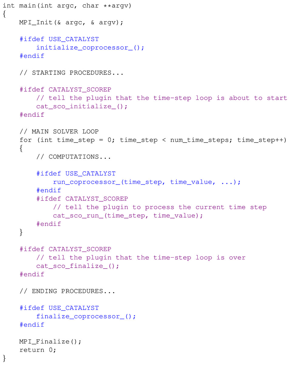
Figure 3: Illustrative example of changes needed in a simulation code due to Catalyst (blue) and then due to the plugin (violet).
Combining both tools
In our previous works (Alves & Knüpfer, 2019; Alves & Knüpfer, 2020), a Score-P plugin has been developed, which allows performance measurements for an arbitrary number of manually selected code regions and communication data (i.e., messages exchanged between MPI ranks) to be mapped to the simulation’s original geometry, by means of its Catalyst adapter (a feature now called geometry mode).
In this paper, we are extending our software to map those measurements to a three-dimensional representation of the cluster’s topology, by means of the plugin’s own Catalyst adapter (a new feature named topology mode). The plugin must be turned on at run-time through an environment variable (export SCOREP_SUBSTRATE_PLUGINS=Catalyst), but works independently of Score-P’s profiling or tracing modes being actually on or off. Like Catalyst, it needs three function calls (initialize, run and finalize) to be introduced in the source code, illustrated in violet at Fig. 3. However, if the tool is intended to be used exclusively in topology mode, the blue calls shown at Fig. 3 are not needed, given in this mode the plugin depends only on its own Catalyst adapter (i.e., the simulation code does not need to have any reference to VTK whatsoever).
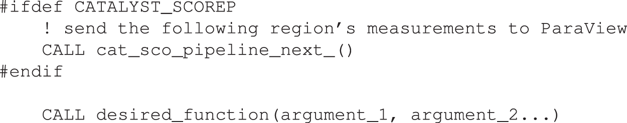
Finally, a call must be inserted before each function to be pipelined, as illustrated in Fig. 4. This layout ensures that the desired region will be captured when executed at that specific moment and not in others (if the same routine is called multiple times–with distinct inputs–throughout the code, as it is common for CFD simulations). The selected functions may even be nested. This is not needed when tracking communications between ranks, as the instrumentation of MPI regions is made independently at run-time (see “Performance Measurement” above).
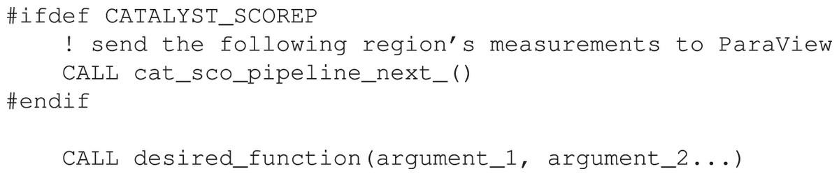
Figure 4: Illustrative example of the call to tell the plugin to show the upcoming function’s measurements in ParaView.
Evaluation
This section presents how our work is going to be evaluated.
Settings
Three test-cases will be used to demonstrate the new functionality of the plugin: two well-known benchmarks and an industry-grade CFD Code. All simulations were done in Dresden University’s HPC cluster (Taurus), whose nodes are interconnected through Infiniband®. Everything was built/tested with release 2018a of Intel® compilers in association with versions 6.0 of Score-P and 5.7.0 of ParaView.
Benchmarks
The NAS Parallel Benchmarks (NPB) (Frumkin, Jin & Yan, 1998) “are a small set of programs designed to help evaluate the performance of parallel supercomputers. The benchmarks are derived from computational fluid dynamics (CFD) applications and consist of five kernels and three pseudo-applications”. Here one of each is used: the Multi-Grid (MG) and the Block Tri-diagonal (BT) respectively (version 3.4). Both were run in a Class D layout by four entire Sandy Bridge nodes, each with 16 ranks (i.e., pure MPI, no OpenMP), one per core and with the full core memory (1,875 MB) available. Their grids consist of a parallelepiped with the same number of points in each cartesian direction. Finally, both are sort of “steady-state” cases (i.e., the time-step is equivalent to an iteration-step).
In order for the simulations to last at least 30 min,4 MG was run for 3,000 iterations (each comprised of nine multigrid levels), whereas BT for 1,000. The plugin generated VTK output files every 100 iterations for MG (i.e., 30 “stage pictures” by the end of the simulation, 50 MB of data in total), every 50 iterations for BT (20 frames in the end, same amount of data), measuring the solver loop’s central routine (mg3P and adi respectively) in each case.
Industrial CFD code
Hydra is Rolls-Royce’s in-house CFD code (Lapworth, 2004), based on a preconditioned time marching of the Reynolds-averaged Navier–Stokes (RANS) equations. They are discretized in space using an edge-based, second-order finite volume scheme with an explicit, multistage Runge–Kutta scheme as a steady time marching approach. Steady-state convergence is improved by multigrid and local time-stepping acceleration techniques (Khanal et al., 2013). Figure 5 shows the test case selected for this paper: it represents a simplified (single cell thickness), 360° testing mesh of two turbine stages in an aircraft engine, discretized through approximately one million points. Unsteady RANS calculations have been made with time-accurate, second-order dual time-stepping. Turbulence modelling was based on standard two-equation closures. Preliminary analyses with Score-P and Cube revealed two code functions to be especially time-consuming: iflux_edge and vflux_edge; they were selected for pipelining.
Here the simulations were done using two entire Haswell nodes, each with 24 ranks (again pure MPI), one per core and with the entire core memory (2,583 MB) available. Figure 5 shows the domain’s partitioning among the processes. The shape of the grid, together with the rotating nature of two of its four blade rings (the rotors), anticipates that the communication patterns here are expected to be extremely more complex than in the benchmarks.
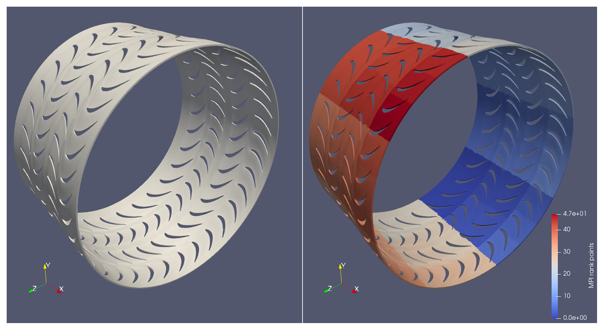
Figure 5: Geometry used in the industrial CFD code simulations (left) and its partitioning among processes for parallel execution (right).
One full engine’s shaft rotation was simulated, comprised of 200 time-steps (i.e., one per 1,8°), each internally converged through 40 iteration steps. The plugin was generating post-mortem files every 20th time-step (i.e., every 36°), what led to 10 stage pictures (12 MB of data) by the end of the simulation.
Results
The second part of this section presents the results of applying our work on the selected test-cases. The benchmarks will be used more to illustrate how the tool works, whereas a true performance optimization task will be executed with the industrial CFD code.
Benchmarks
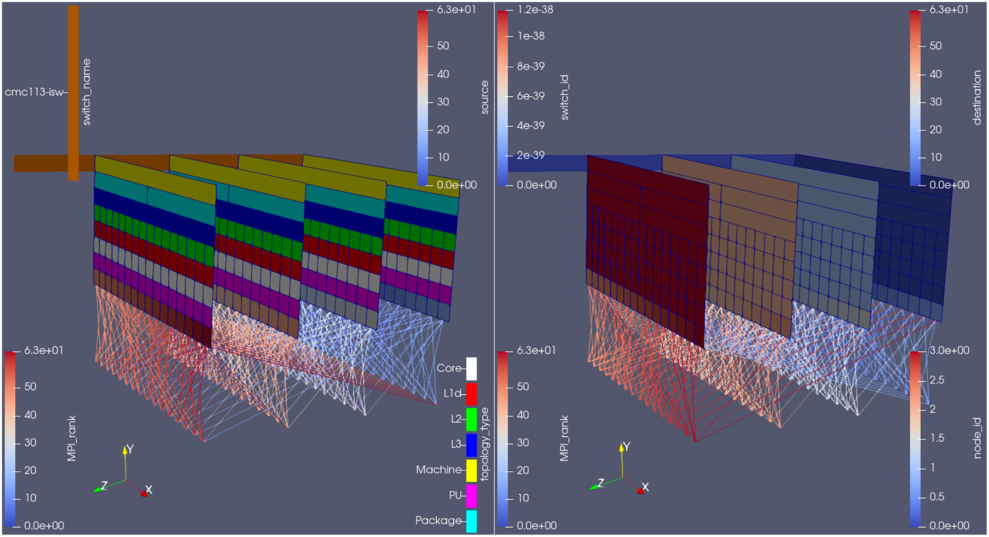
Figure 6 shows the plugin outputs for an arbitrary time-step in the MG benchmark. The hardware information (i.e., in which core, socket etc. each rank is running) is plotted on constant z planes; the network information (i.e., switches that need to be traversed in order for inter-node communications to be performed), on its turn, is shown on the constant x plane.
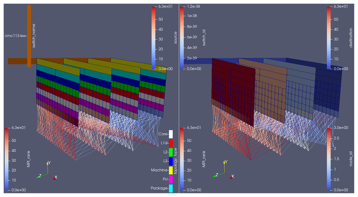
Figure 6: Plugin outputs for an arbitrary time-step at the MG benchmark, visualized from the same camera angle, but with different parameters on each side.
Score-P’s measurements, as well as the rank id number, are shown just below the processing unit (PU) where that rank is running, ordered from left to right (in the x direction) within one node, then from back to front (in the z direction) between nodes. Finally, the MPI communication made in the displayed time-step is represented through the lines connecting different rank ids’ cells.
Here, notice how each compute node allocated to the job becomes a plane in ParaView. They are ordered by their id numbers (see the right-hand side of Fig. 6) and separated by a fixed length (adjustable at run-time through the plugin’s input file). Apart from the node id, it is also possible to color the planes by the topology type, i.e., if the cell refers to a socket, a L3 cache, a processing unit etc., as done on the left side of the figure.
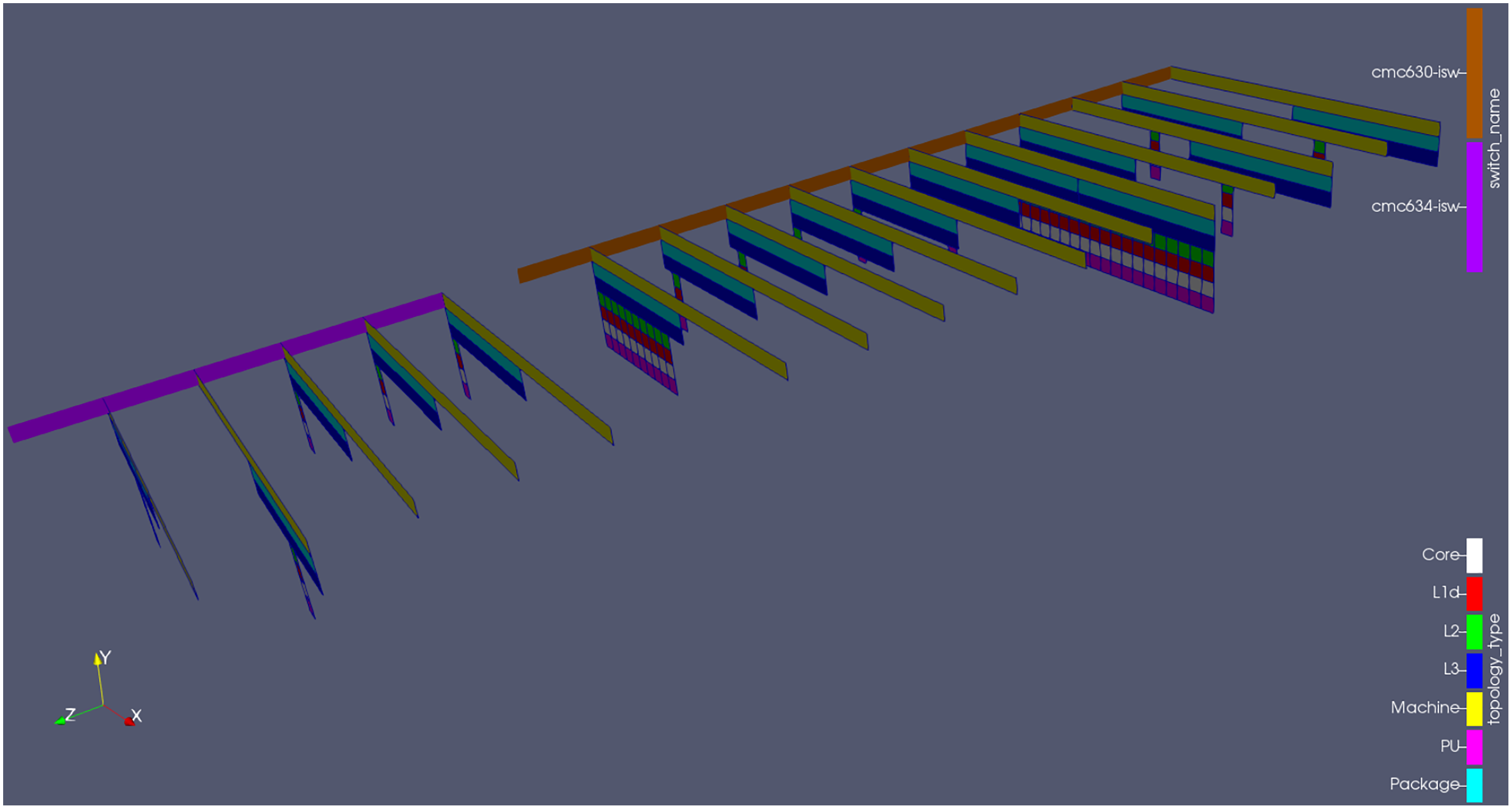
Only the resources being used by the job are shown in ParaView, as to minimize the plugin’s overhead and in view that drawing the entire cluster would not help the user to understand the code’s behaviour5 . This means that, between any pair of planes in Fig. 6 there might be other compute nodes (by order of id number) in the cluster infrastructure; but, if that is the case, none of its cores are participating in the current simulation. The inter-node distance in ParaView will be bigger, however, if the user activated the drawing of network topology information and the compute nodes involved in the simulation happen to be located in different network islands, as shown on Fig. 7. This is indeed intuitive, as messages exchanged between nodes under different switches will need to travel longer in order to be delivered (when compared to those exchanged between nodes under the same switch).
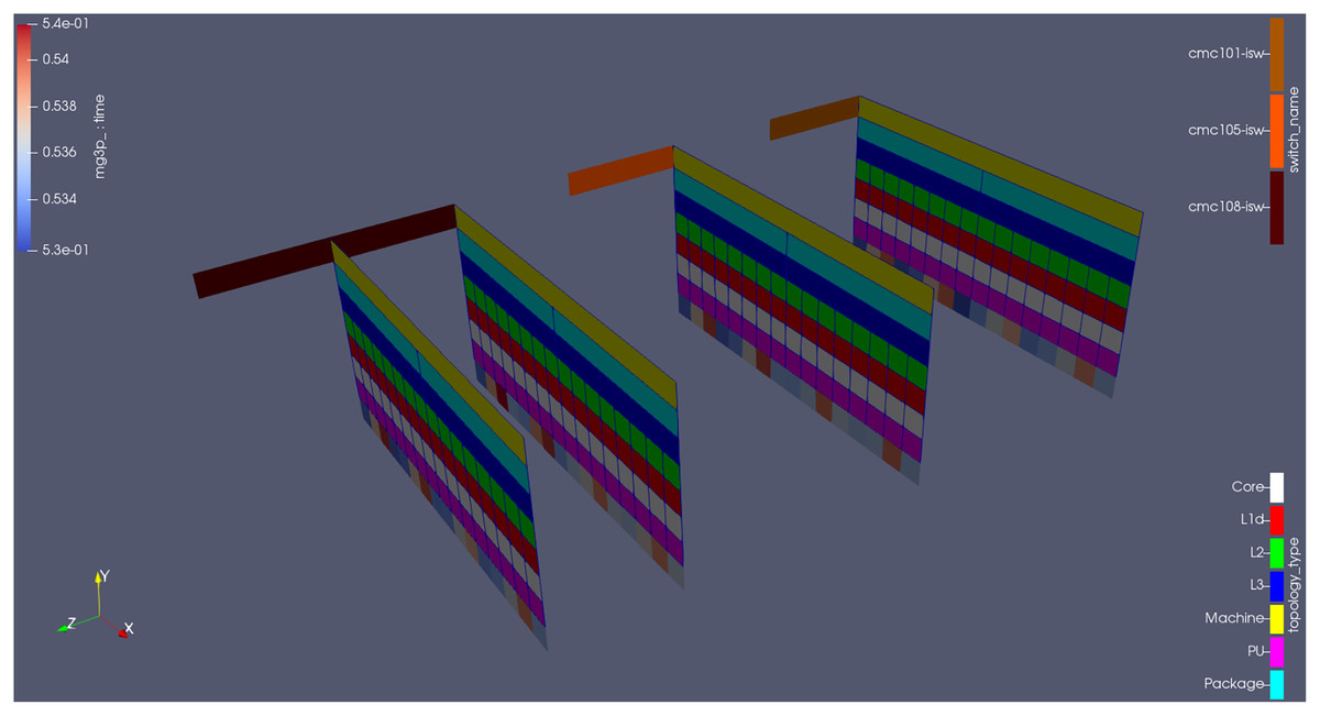
Figure 7: Plugin outputs for the MG benchmark.
The leaf switch information is encoded both on the color (light brown, orange and dark brown) and on the position of the node planes (notice the extra gap when they do not belong to the same switch).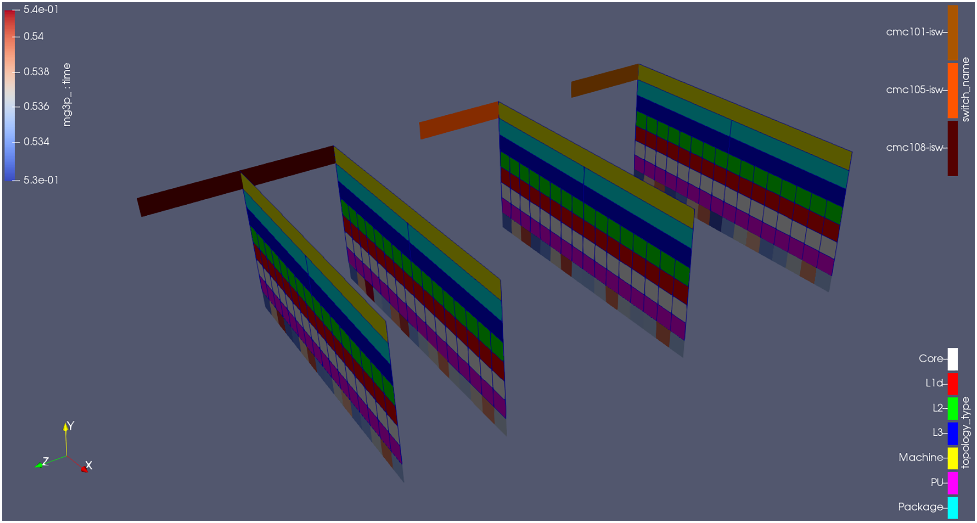
Taurus uses Slurm (https://slurm.schedmd.com/), which carefully allocates the MPI ranks by order of compute node id (i.e., the node with lower id will receive the first processes, whereas the node with higher id will receive the last processes). It also attempts to place those ranks as close as possible to one another (both from an intra and inter node perspectives), as to minimize their communications’ latency. But just to illustrate the plugin’s potential, Fig. 8 shows the results when forcing the scheduler to use at least a certain amount of nodes for the job. Notice how only the sockets (the cyan rectangles in the figure) where there are allocated cores are drawn in the visualization; the same applies to the L3 cache (the blue rectangles). Also, notice how the switches are positioned in a way that looks like a linkage between the machines (the yellow rectangles in the figure) they connect. This is intentional (it makes the visualization intuitive).
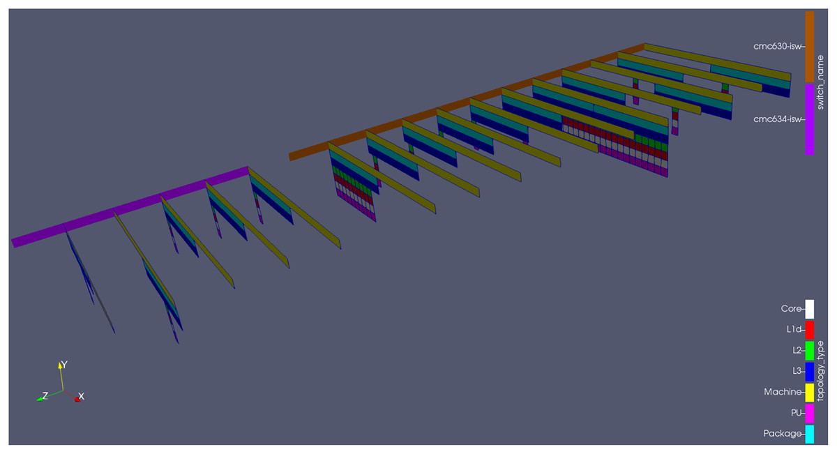
Figure 8: Poorly distributed ranks across compute nodes, for illustration purposes.
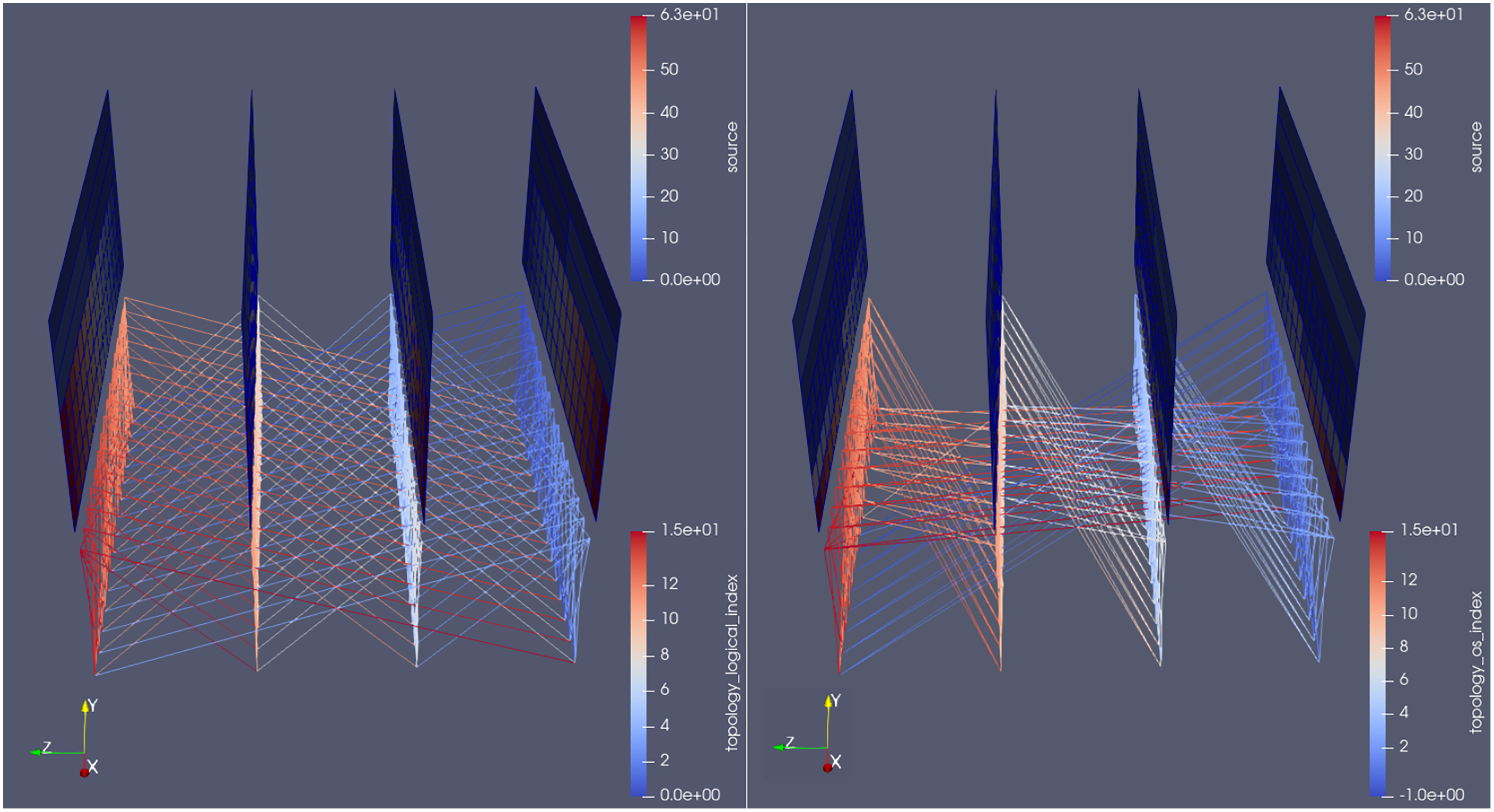
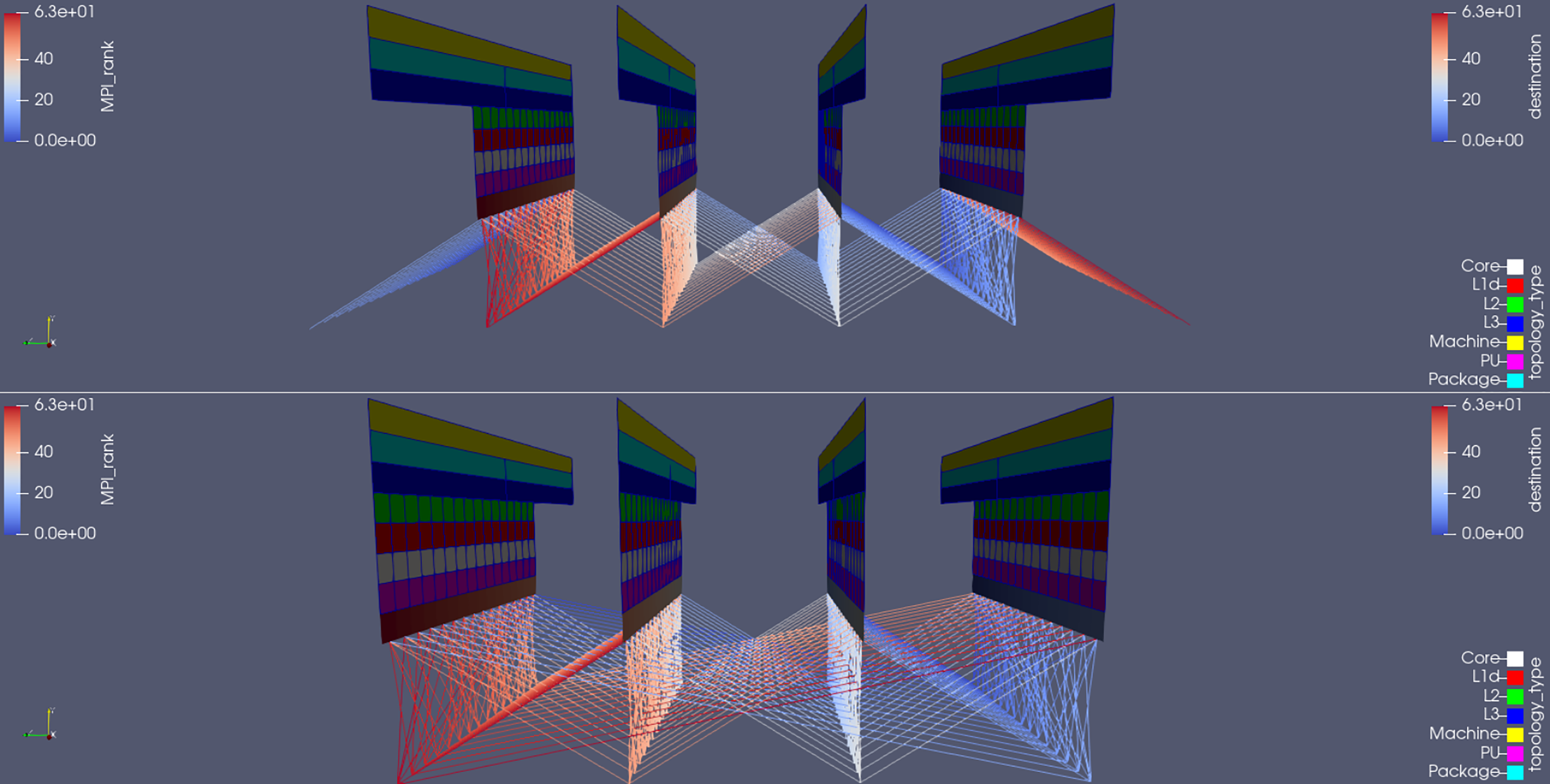
With regards to messages sent between ranks, in order to facilitate the understanding of the communication behavior, the source/destination data is also encoded in the position of the lines themselves: they start from the bottom of the sending rank and go downwards toward the receiving one. This way, it is possible to distinguish–and simultaneously visualize–messages sent from A to B and from B to A. In Fig. 9, notice how the manipulation of the camera angle (an inherent feature of visualization software like ParaView) allows the user to immediately get useful insights about its code behaviour (e.g., the even nature of the communication channels in MG versus the cross-diagonal shape in BT).
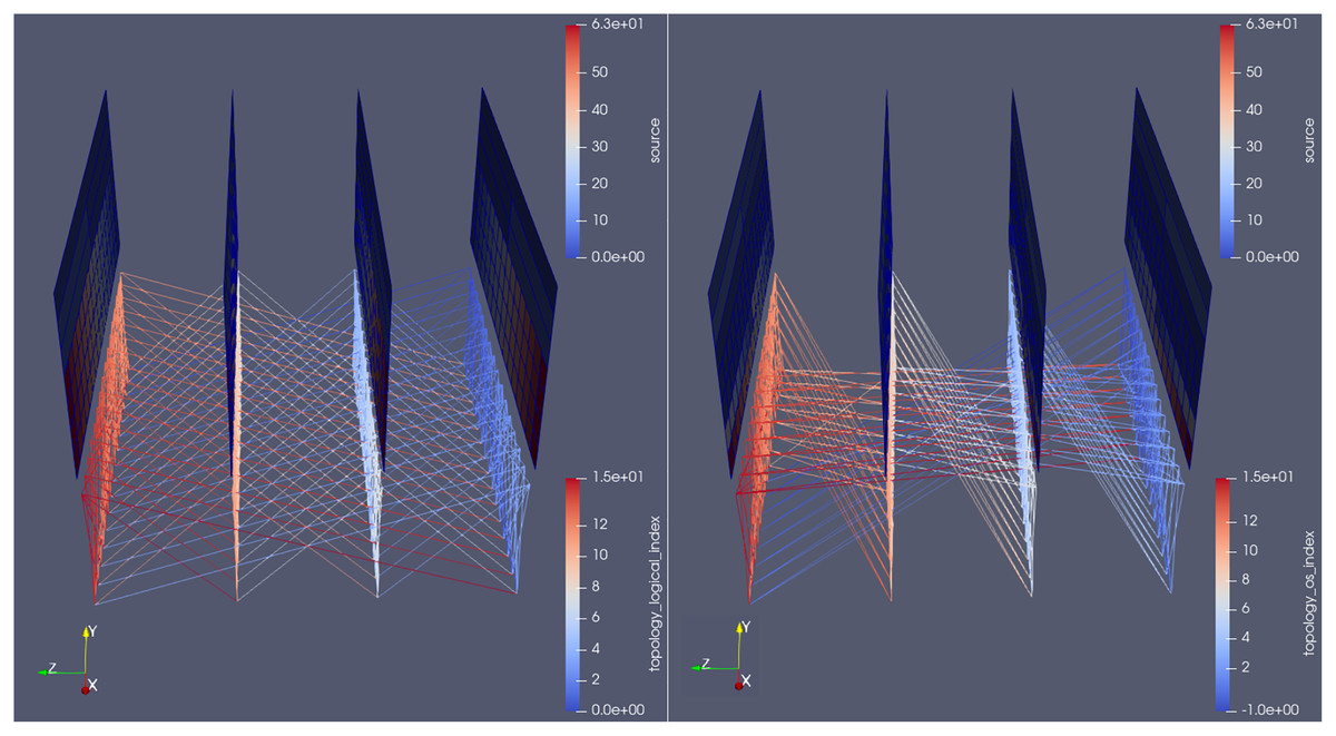
Figure 9: Side-by-side comparison of the communication pattern between the MG (left) and BT (right) benchmarks, at an arbitrary time-step, colored by source rank of messages.
In Fig. 9, notice also how all ranks on both benchmarks talk either to receivers within the same node or the nodes immediately before/after. The big lines connecting the first and last nodes suggest some sort of periodic boundary condition inside the grid. This can be misleading: lines between cores in the first and last nodes will need to cross the entire visualization space, making it harder to understand. For that reason the plugin’s runtime input file has an option to activate a periodic boundary condition tweak, whose outputs are visible in Fig. 10. It shows the topology when using Haswell nodes, whose sockets have four more cores than Sandy Bridge. The communication lines are colored by destination rank of the messages; they refer to the MG benchmark. Notice how the periodic nature of this test-case’s boundary conditions become clearer in the top picture: the big lines mentioned above are gone.
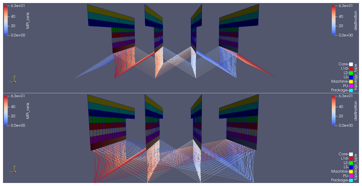
Figure 10: Side-by-side comparison of the communication pattern in the MG benchmark when using the periodic boundary condition feature (top) or not (bottom); communication lines are colored by destination rank of messages.
Finally, Slurm comes with a set of tools which will go through the cluster network (Infiniband, in our case) and automatically generate its connectivity information, saving it into a file. This file has been used as the network topology configuration file and is read by the plugin at run time. If it is not found, the drawing of the planes in ParaView will not take the switches into account.
Industrial CFD code
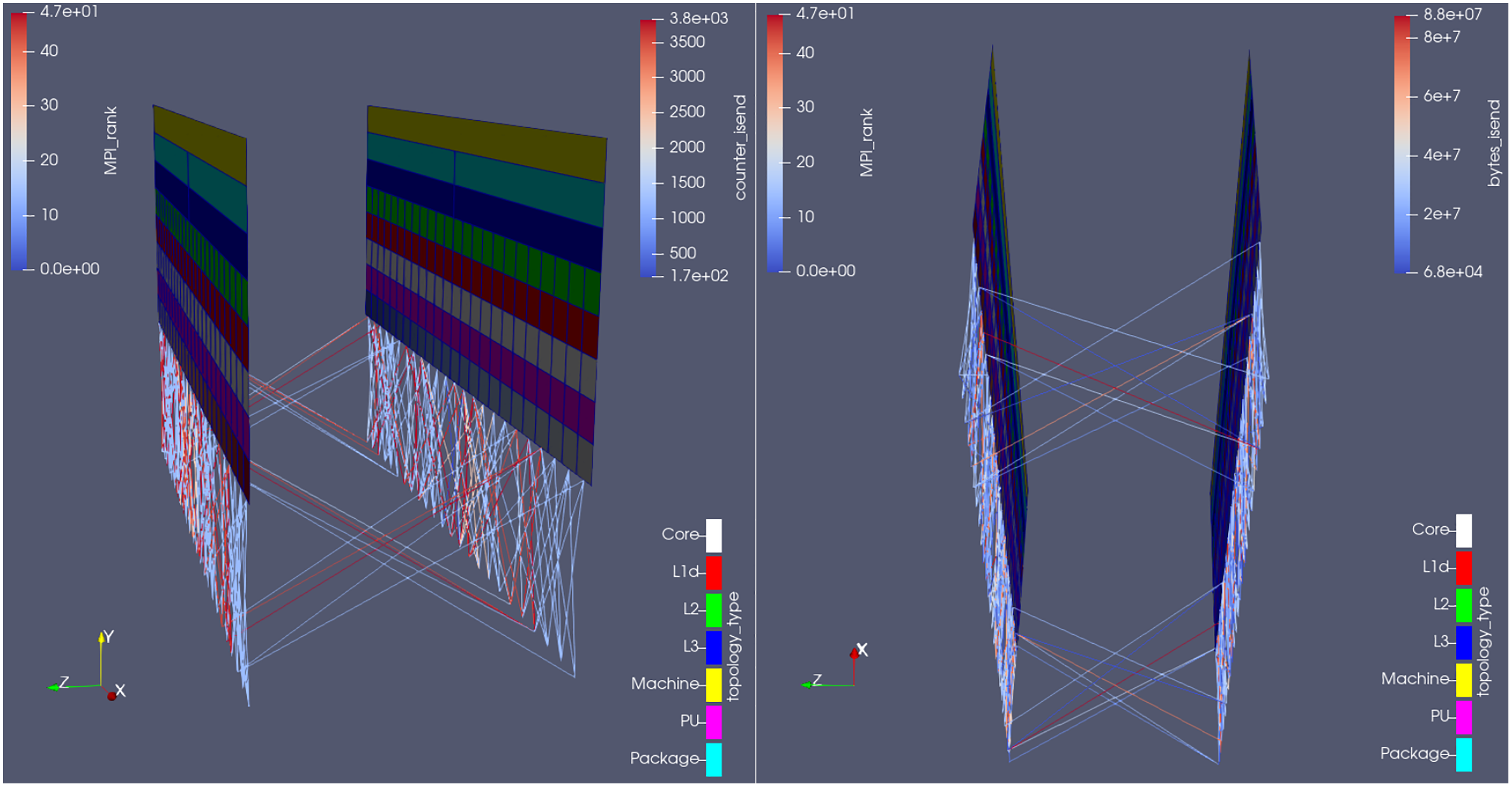
Figure 11 shows the plugin outputs for an arbitrary time-step in the Hydra test-case, from two different camera angles; the communication lines are colored by number of MPI_Isend calls (left) and total amount of bytes sent on those calls (right) on that time-step. Notice on the right-hand side how many of the communication channels (the lines) did not properly transfer any data in that time-step (their blue color corresponds to 0 in the bytes_isend scale) and should therefore be removed. Also because the least used channels were used 1,500 times within that time-step, as seen from the lower limit of the scale on the left part of the figure (counter_isend, which refers to the total amount of times MPI_Isend was called in the time-step shown). In other words, the plugin was able to estimate how many communication calls (per sender/receiver pair) could be spared per time-step in Rolls-Royce’s code, and where (i.e., which ranks are involved).
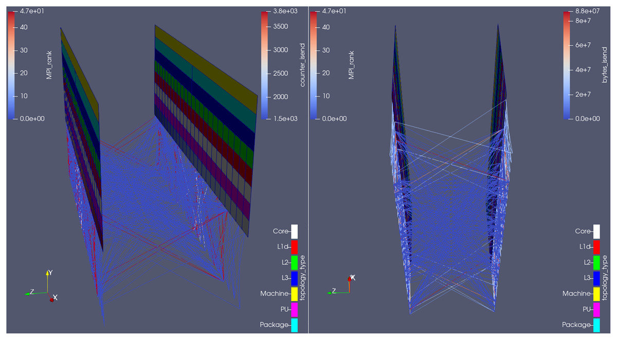
Figure 11: Visualization of the communication pattern in Hydra from two different camera angles, at an arbitrary time-step, colored by number of MPI Isend calls (left) and total amount of bytes sent on those calls (right) on that time-step.
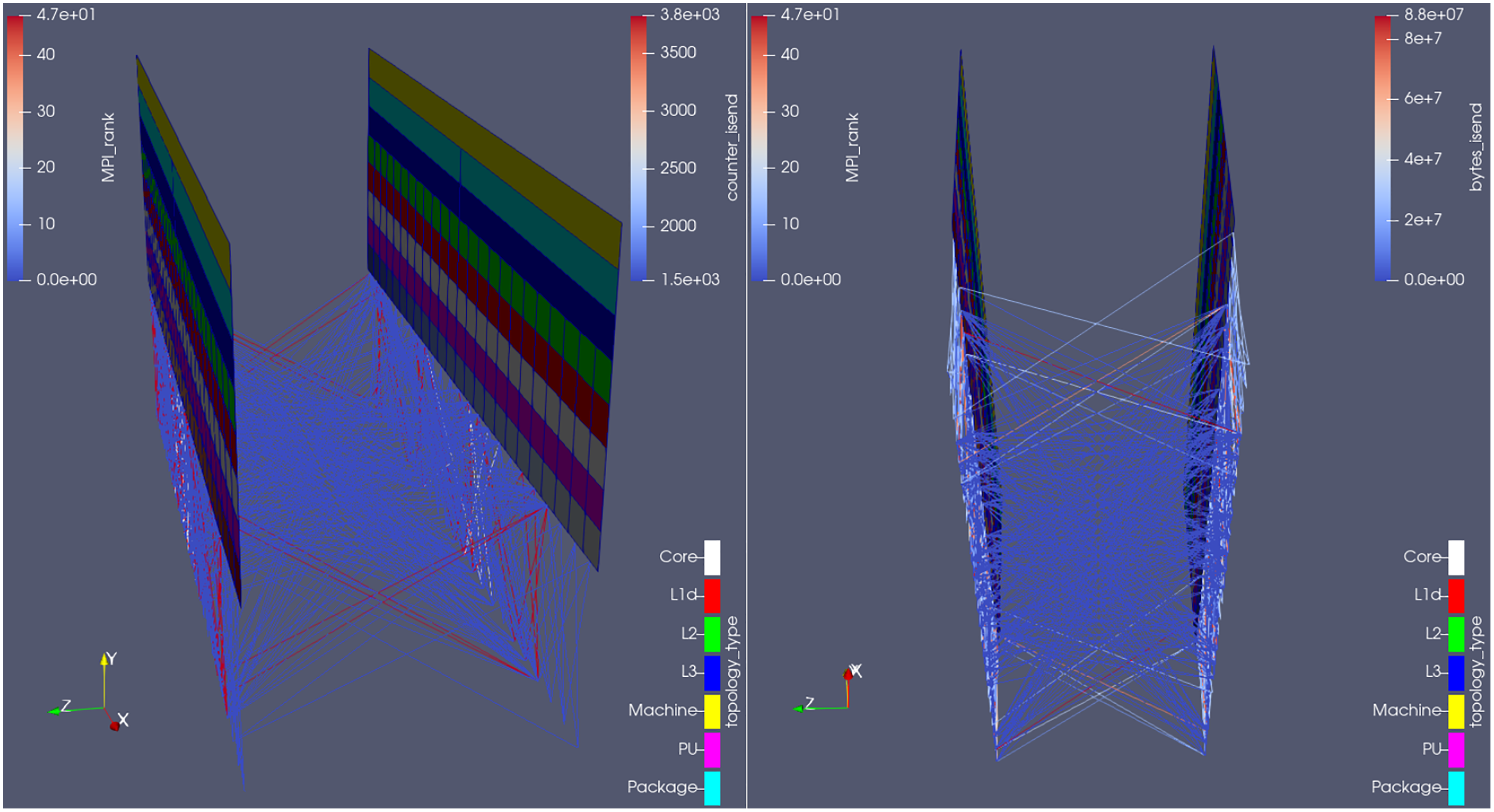
We submitted such results to Rolls-Royce, whose developers fixed this issue. The new communication behavior can be seen in Fig. 12. Notice how the minimum number of messages sent between any pair of processes dropped from 1,500 to 170 (see the lower limit of the scale at the upper-right corner of the left picture); analogously, how the minimum amount of data sent raised from 0 to 68 kB (see the lower limit of the scale at the upper-right corner of the right picture) i.e., now there are no more empty messages being sent, and this is visible in the visualization of the communication lines. The plugin has been successfully used in a real life performance optimization problem, whose detection would be difficult if using the currently available tools.
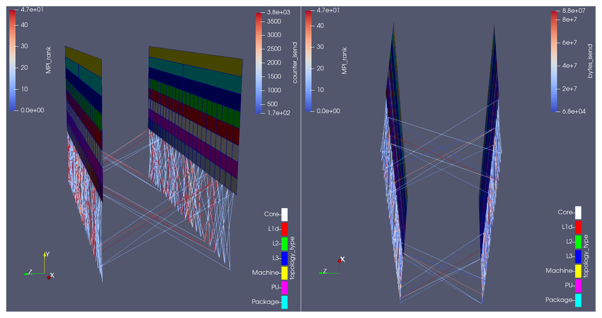
Figure 12: Visualization of the new communication pattern in Hydra from two different camera angles,at an arbitrary time-step, colored by number of MPI_Isend calls (left) and total amount of bytes sent on those calls (right) on that time-step.
We also attempted to reproduce such analysis via the existing 2D communication matrix display in Vampir. This was done with the original, i.e., unoptimized, version of the code. We traced a single time step due to overhead considerations (higher overhead for full event tracing when compared to using Score-P only for its substrate plugin API) and to explicitly isolate a single time step so that it directly corresponds to Figs. 11 and 126 . The results can be seen in Fig. 13 below: dark blue entries correspond either to no messages or to messages with zero bytes sent between the sender and receiver ranks. With this, it is indeed possible to identify areas with high number of messages (the green spots on the left picture) but no (or few) bytes sent (no corresponding patterns in the right picture).
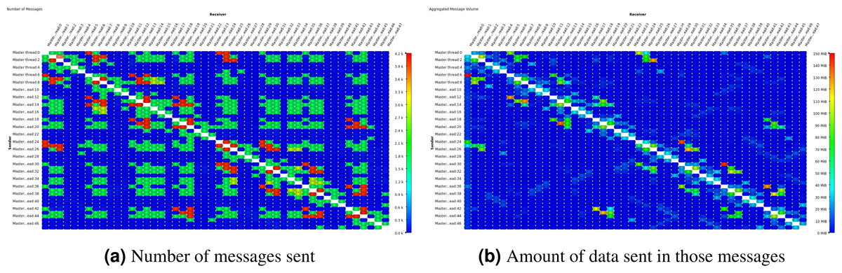
Figure 13: Comparative displays of the number of messages sent and amount of data sent in those messages after the execution of one time step in Hydra test case, shown on Vampir 2D matrices.
However, with the existing Vampir visualization and similar visualization schemes it is impossible to see the hardware topology next to the communication behavior. In our new visualization scheme in Fig. 12 one can clearly tell that there are two compute nodes with a number of CPU cores each. It is most obvious whether a message is transmitted between neighbor CPU cores or between cores in different compute nodes. Performance metrics are mapped onto the communication lines via the color scale. It is also easy to tell apart the good communication pattern in Fig. 12 where many messages are exchanged within a node but few between the nodes, from the worse communication pattern in Fig. 11 where many messages are exchanged between nodes. In contrast, the existing communication matrix displays show only the effects of the hardware topology on the performance behavior. Sometimes, there is a clear situation where message speeds between neighboring ranks are high but much lower between far-apart ranks. This results in a block-diagonal picture similar to Fig. 13B if it would show message speed. This is obviously caused by inter-node vs. intra-node communication speeds and easy enough to explain for an expert. But what about subtle situations where this is hardly visible or where it should be visible but isn’t? Then the representation of the pure hardware topology is missing. Therefore, the newly introduced topology view as presented here provides a clear advantage to the analyst.
Using this analysis revealed another peculiar performance pattern, see Fig. 14. The left hand side shows the typical situation of most simulation time steps. The right hand side in contrast presents an atypical situation that we easily noticed due to the time-step based visualization scheme. Communication with the code owners revealed that the latter behavior is caused by I/O activity which outputs the simulation result in regular intervals. This includes heavy MPI communication in the current implementation. It may profit from additional optimization or reorganization, yet this is beyond the scope of this paper.
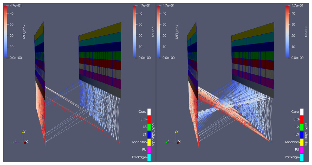
Figure 14: Topology mode of the plugin being used in Rolls-Royce’s CFD code, comparing (from the same camera angle) the overall state of communications in two different time-steps: when (right) and when not (left) Hydra is saving its native outputs to disk.
The analysis reveals a burst in point-to-point communication when that is the case, what is undesired (it would have been better to use collective MPI calls).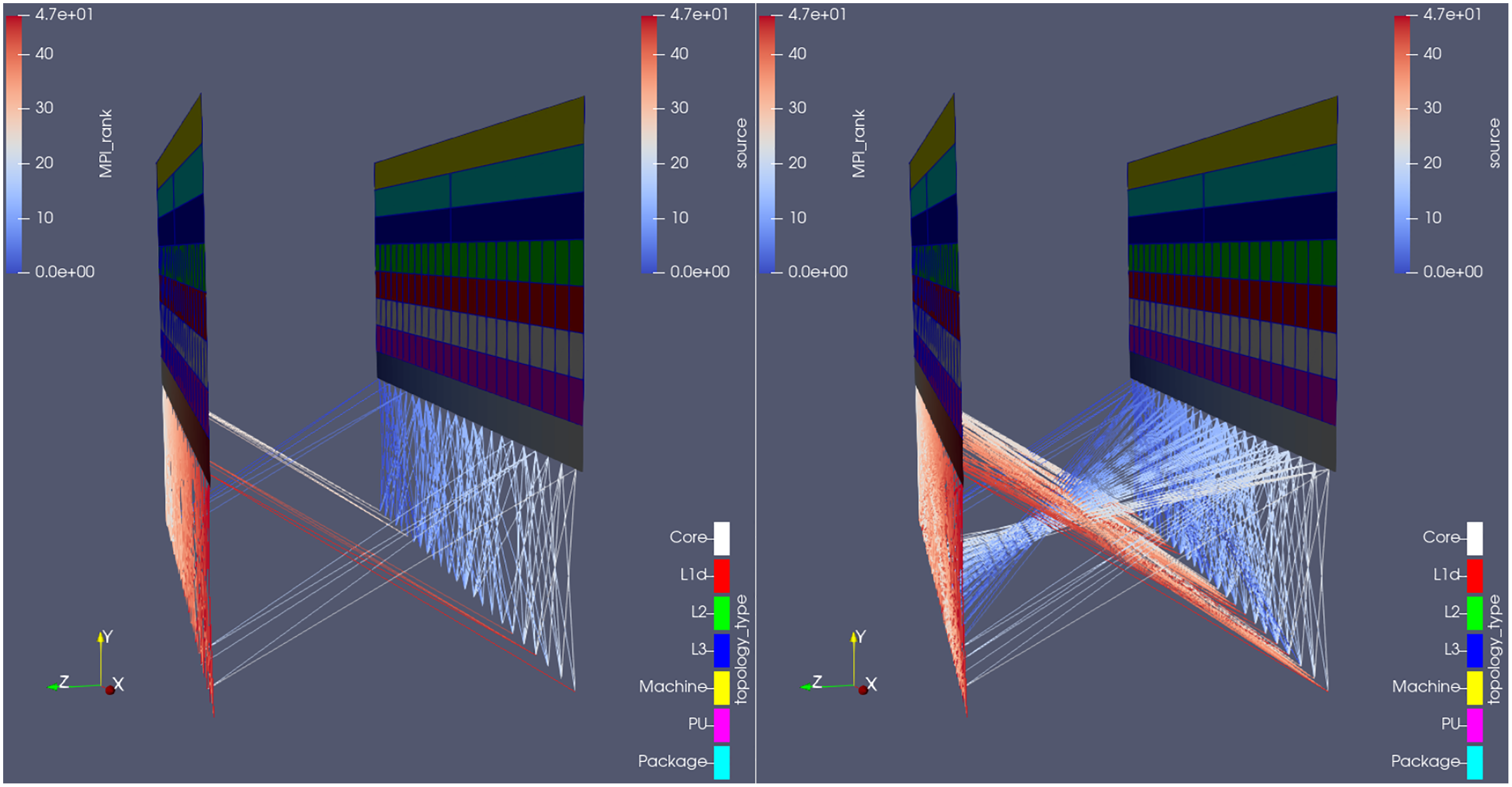
Overhead
Provided we are talking about performance analysis, it is necessary to investigate the impact of our tool itself on the performance of the instrumented code execution.
Settings
In the following tables, the baseline results refer to the pure simulation code, running as per the settings presented in “Evaluation”; the numbers given are the average of 5 runs ± 1 relative standard deviation. The + Score-P results refer to when Score-P is added onto it, running with both profiling and tracing modes deactivated (as neither of them is needed for the plugin to work)7 . Finally, ++ plugin refers to when the plugin is also used: running only in topology mode and in only one feature (regions or communication) at a time8 and on the iterations when there would be generation of output files9 . The percentages shown in these two columns are not the variation of the measurement itself, but its deviation from the average baseline result.
Score-P was always applied with the –nocompiler flag. This option is enough when the plugin is used to show communication between ranks, as no instrumentation (manual or automatic) is needed when solely MPI calls are being tracked. On the other hand, the instrumentation overhead is considerably higher when the target is to measure code regions, as every single function inside the simulation code is a potential candidate for analysis (as opposed to when tracking communications, when only MPI-related calls are intercepted). In this case, it was necessary to add the –user Score-P compile flag and manually instrument the simulation code (i.e., only the desired regions were visible to Score-P). An intervention as illustrated in Fig. 15 achieves this: if MODULO… additionally guarantees measurements are collected only when there would be generation of output files and at time-step 1–the reason for it is that Catalyst runs even when there is no post-mortem files being saved to disk (as the user may be visualizing the simulation live) and the first time-step is of unique importance, as all data arrays must be defined then (i.e., the (dis)appearance of variables in later time-steps is not allowed)10 . Finally, when measuring code regions, interception of MPI-related routines was turned off at run-time11 .
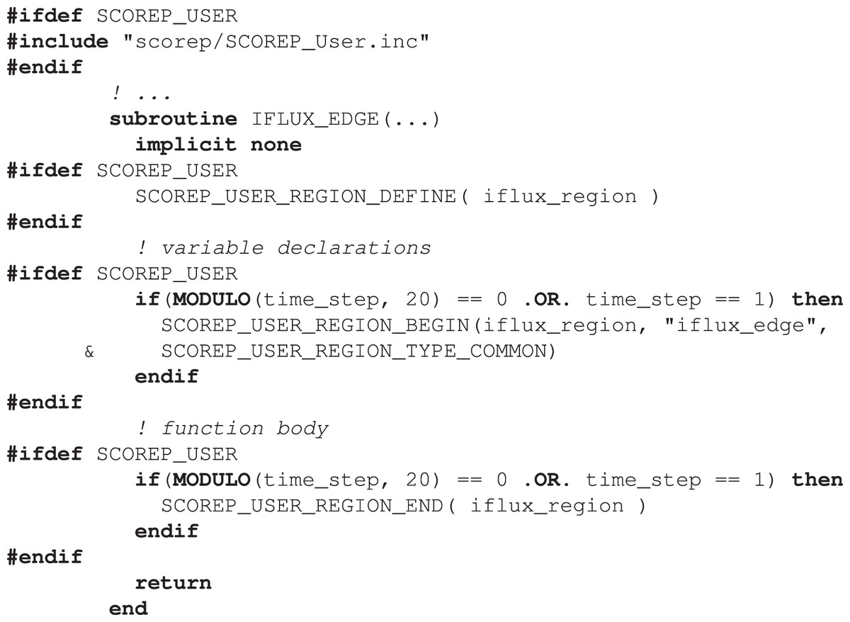
Figure 15: Example of a manual (user-defined) code instrumentation with Score-P; the optional if clauses ensure measurements are collected only at the desired time-steps.
Results
Tables 1 and 2 show the impact of the proposed plugin on the test-cases performance. The memory section refers to the peak memory consumption per parallel process, reached somewhen during the simulation; it neither means that all ranks needed that amount of memory (at the same time or not), nor that the memory consumption was like that during the entire simulation. Score-P itself introduced no perceptible overhead; on its turn, the plugin did, an that is because it is equipped with a Catalyst adapter (whose footprint lies mostly on memory consumption (Ayachit et al., 2015)). Catalyst needs this memory to store the artificial geometry’s (the topological representation of the hardware resources being used) coordinates and cells definition, plus all the data arrays associated with them (amount of times a function was executed, amount of messages sent between two ranks etc.), for each time-step during the simulation. Hence the added memory footprint is higher.
| Running time | Memory (MB) | |||||
|---|---|---|---|---|---|---|
| ++ Plugin | + Score-P | Baseline | ++ plugin | + Score-P | Baseline | |
| MG | 31 m 42 s (0%) | 31 m 09 s (−1%) | 31 m 37 s ± 2% | 648 (42%) | 479 (5%) | 455 ± 0% |
| BT | 34 m 28 s (0%) | 34 m 26 s (0%) | 34 m 28 s ± 1% | 648 (42%) | 478 (5%) | 455 ± 0% |
| Hydra | 47 m 04 s (12%) | 43 m 52 s (4%) | 42 m 00 s ± 0% | 382 (22%) | 323 (3%) | 314 ± 0% |
| Running time | Memory (MB) | |||||
|---|---|---|---|---|---|---|
| ++ Plugin | + Score-P | Baseline | ++ Plugin | + Score-P | Baseline | |
| MG | 31 m 34 s (0%) | 31 m 09 s (−1%) | 31 m 37 s ± 2% | 648 (42%) | 479 (5%) | 455 ± 0% |
| BT | 34 m 24 s (0%) | 34 m 08 s (−1%) | 34 m 28 s ± 1% | 648 (42%) | 477 (5%) | 455 ± 0% |
| Hydra | 42 m 53 s (2%) | 43 m 50 s (4%) | 42 m 00 s ± 0% | 397 (26%) | 316 (1%) | 314 ± 0% |
The run time overhead, on its turn, is only critical when measuring the two code regions selected in Hydra: they are called millions of times per time-step, hence their instrumentation is heavy. Otherwise the plugin’s or Score-P’s footprints lie within the statistical oscillation of the baseline results.
Conclusions
In this paper, we have extended our software to allow mapping performance data to a three-dimensional representation of the cluster’s architecture, by means of (combining) the code instrumenter Score-P and the graphics manipulation program ParaView. The tool, which takes the form of a Score-P plugin, introduces the following novel capabilities to the spectrum of code analysis resources:
detailed view up to topology component level (i.e., in which core of which socket of which node a specific MPI rank is running);
limit visualization to resources being used by the simulation;
native association with the simulation’s time-step;
individual components of the visualization (like the network switches) are optional to produce and to display (i.e. see only what you want to see);
easily distinguish between messages coming from ranks within the same compute node from those coming from ranks running in other compute nodes, something not possible in a tool like Vampir;
individually applicable color scale to each element of the visualization, allowing, for example, to color the communication lines by amount of bytes sent, receiver id, sender id etc (something also not possible in Vampir);
All that under the graphic quality of today’s top-of-the-art visualization program, ParaView: render views are fully manipulatable and tens of filters are available to further dig into the data. ParaView is the best option as visualization software because of all the resources already available in–and experience accumulated by–it after decades of continuous development. Visualization techniques do not use to be the specialization field of programmers working with code performance: it is more reasonable to take advantage of the currently available graphic programs than attempting to equip the performance tools with their own GUIs (from scratch). On the other hand, by working in close contact with Rolls-Royce’s engineers, we have noticed how important it is for them to obtain the information they need (in our case, the performance of their code) in a straightforward manner. In this sense, using pre-existing visualization tools (like ParaView, which they already use to analyse the flow solution) represents a major benefit to them, as they don’t need to learn new software (like Cube or Vampir) for the task, but rather stick with programs they are already used to.
Our tool is based exclusively on open-source dependencies; its source code is freely available (https://gitlab.hrz.tu-chemnitz.de/alves--tu-dresden.de/catalyst-score-p-plugin), as the raw data of the benchmark results presented in this paper12 . It works with either automatic or manual code instrumentation and independently of Score-P’s profiling or tracing modes. Lastly, its output frequency (when doing post-mortem analyses) is adjustable at run-time (through the plugin input file), like in Catalyst itself.
Future work
We plan to continue this work in multiple directions:
Scale the tool: To keep testing our tool in bigger and bigger test cases, in order to investigate its scalability limits (if any).
Develop new visualization schemes for perfomance data: To take advantage of the multiple filters available in ParaView for the benefit of the performance optimization branch, e.g., by recreating in it the statistical analysis–display of average and standard deviation between the threads/ranks’ measurements–already available in other tools.
Remove the necessity of the topology configuration file: When running the plugin in topology mode, get the network details directly from system libraries (as done with the hardware details). Both Slurm and the hwloc team–through its sister project, netloc (https://www.open-mpi.org/projects/netloc/) (Goglin, Hursey & Squyres, 2014)–are straining in that direction, but it is currently not yet possible (partially because the retrieval of the switches configuration requires root access and therefore needs to be executed by the cluster’s admins).
Extend list of detectable communication calls: To make the tool capable of detecting calls of other communication protocols, like GPI-213 (Grünewald & Simmendinger, 2013). This will require a respective extension of Score-P’s substrate plugin API.
Extend list of detectable perfomance phenomena: To extend the list of performance-relevant phenomena which can be detected by the plugin, for example: cache misses, memory accesses, I/O flows etc. This will also require a respective extension of Score-P’s substrate plugin API.
Use plugin for teaching: Finally, explore the possibility of using the tool for teaching of parallel computing, especially in topics like data locality, job allocation, computer architecture, sharing of computational resources etc.